Saturday, February 8, 2014

3 Things I Listen To While Working

For years I always plugged into music while working.  However, I find sometimes that music- although wonderful and energizing- can get monotonous and leave me alone with my own thoughts too much (and sometimes I don't want to hear my own thoughts! Let me listen to other thoughts!). It makes me understand why so many of my colleagues listen to things like NPR in the background while they flutter around their studios.

I wanted to share some of my favorite things to listen to while I work. Some of them are very much art-related...some not!


1)  Smart Creative Women

This website was started by Monica Lee in 2011, and serves as a platform for great interviews with artists and industry leaders that are meant to educate and inspire. Watch her talk business and the creative life with big names like Lilla Rogers, Kathy Davis, and Kelly Rae Roberts. You can also find out more about her e-course, Smart Creative Style


2)  Serious Jibber-Jabber with Conan O'Brien

I stumbled upon this online interview series featuring the always delightful funny man about six months ago. These one-on-one interviews are actually very centered on the creative process, as Conan talks shop with individuals like Mel Brooks, Jack White, and the old writing team from Coco's days working on The Simpsons. While obviously full of humor, the interviews are also intimate and humble.


3) Star Wars Prequels / Star Trek Movie Reviews by Red Letter Media

In all seriousness, I have lost count of how many times I have listened to these video reviews where fictional character Mr. Plinkett tears apart the Star Wars prequels and Next Gen cast Star Trek movies. What makes them so great is the humor and clever editing that delivers these well-made points to you, whether it's the horrible dialogue written by Lucas or Picard's inconsistent movie persona (and the fact that dune buggies do NOT make sense in space exploration, people). These videos have a huge following and have spurred reviews for other movies like Avatar and Indiana Jones and the Kingdom of the Crystal Skull. Always good for a laugh!


Friday, February 7, 2014

Interview on Happy Happy Blog

Bounce over to the Happy Happy Art Collective Blog to see my interview! You can also scroll down and meet some of the other artists. We talk about our inspirations, struggles, and what we love about making art.

Wednesday, February 5, 2014

Happy Happy Art Collective


A while ago I mentioned being part of an art collective with other graduates from the Make Art That Sells e-course. I'm so happy to say our website and blog are up! Feel free to check it out and meet everyone.

Sunday, February 2, 2014

The Next Lilla Adventure


I am starting Lilla Roger's MATS Assignment Bootcamp this week, which is a slower and longer e-course that breaks down assignments over a whole month (rather than a week like in regular MATS). If you are interested in taking Lilla Roger's Make Art That Sells e-course, I heavily recommend you take Part A or Part B first before doing bootcamp. Part A and B includes insightful observations about multiple markets, interviews with industry professionals, and detailed homework reviews by Lilla each week. In these classes you will be re-wired in a wonderful way. Then you'll be ready for bootcamp, which is a more self-directed and allows you take all this new information and apply it towards more in-depth assignments. Very excited!

Sunday, January 26, 2014

The Great Work/Home Balance Question...Thingy...


Keith and I sat on the couch this past Saturday, both of us with a cup of coffee held firmly in our hands.  He casually looked over and asked, "Are you working today?"

"No," I said. "I don't think I am."

Truth is, I have been considering what a healthier work/home balance is for me. One would assume that being a self-employed illustrator working from home would be for the most part never  "work", but that is not true or possible. I love my art, and it is my passion. However, to maintain that passion and love, I do need to step away once in a while. When I was a freelancer earlier in my life, weekdays and weekends blurred together, and there was never any sense of being "off". Those who are self-employed know that you are never truly "turned off". There is always a client buzzing around in the back of your brain, or great ideas pop up when you're just trying to chill in front of the T.V. after dinner (in my case, usually watching House Hunters or some other "House Show" as Keith calls them). It can be exhausting when this so-called blurring happens. Physically, emotionally, and creatively exhausting.

What I can do is give myself permission to quiet those thoughts during the weekend. This isn't just about taking a break. There is laundry, dog walking, those positive things in your life called "friends", grocery shopping, house cleaning, and other responsibilities. This weekend I did dip a little into work mode- I played around with a new website, answered some emails, and caught up on some art/design blogs I have been ignoring. I also reconnected with some old friends, went on a long past-due date with Keith, and tried out a new recipe for dinner. As much as this new chapter in my life is about pursuing my art and new opportunities, it's also about appreciating the kind of life I'm trying to allow myself. That life is full of family, friends, discovery... but more importantly the chance to actually enjoy these things. So even though I did not go into my studio this weekend, I did rediscover things that I love, and that in return makes me excited to pop out of bed tomorrow and work on my latest creation.

Friday, January 24, 2014

My Best Advice For Illustration Students.

Take classes that work out your brain.

I am a believer that a good student has a balance of both technical and conceptual skills. That being said, you can never have enough classes that explore editorial and conceptual concepts. It doesn't matter if you want to do comic books, animation, or art for galleries- train yourself to have good ideas and be a problem-solver. Not only will you be a better artist, but you'll be smarter when it comes to other areas of your business- marketing, unique self-promotions, and being able to find opportunities where others don't. At my last corporate job, I realized my editorial illustration background gave me a knack for writing copy and thinking of marketing ideas, which propelled me into another area of the company and was a lot of fun. Not only did I learn a lot from those experiences, but it made me valuable as an employee with multiple skills.

Learn from good teachers, no matter what they teach.

Probably some of the most sound advice I got in college was to not focus on class titles when picking my courses, but rather who was teaching them. There were a bunch of amazing teachers that students flocked to, and you wanted to sponge up their knowledge as much as possible. Maybe they were teaching watercolor techniques, or maybe it was a class focusing on poster design. In the end, find out who the great teachers are in your department and try to have at least one class with each of them.

College is the time to experiment. Step out of your comfort zone.

One of the biggest mistakes you can make is to start a curriculum with a big fat label on yourself: Children's Book Illustrator. Fine Artist. Graphic Designer. Putting yourself in a box will make you miss out on classes that could help you in some way, even if it's not obvious (for instance, you could take a landscape painting class that revolutionizes the way you think about color, which influences your graphic design work). You will have a main focus in your studies, no doubt, but don't put the blinders on and ignore classes that could enrich your skills. Film majors should take print making classes. Illustrators should learn about industrial design. This in a way goes back to the idea of Style Soup, which I have discussed earlier. Remember, The only label you should be wearing during your education is Student.


Wednesday, January 22, 2014

2014: A Wedding, Surtex, And Living In My Pajama Pants almost 24/7 (a.k.a "The Good Life")

Ok, 2014. Bring it!

I mentioned before that my blog was going to BLOW UP. This is because I have recently returned to my freelance illustration and teaching 24/7. Back in October I had started the transition, going to work only three days a week (a real blessing because it allowed me to have a steady income while working two days...frantically...on Part B of Lilla's Make Art That Sells class).

I learned a lot at C.R Gibson, which was my goal. Before the job came along,  I got accepted into an illustration Graduate program a month earlier, but declined it. The reason was that  I really wanted to learn more about licensing, and that's something that would NOT be covered in the program. It was a great program, of course, but I needed a violent shove in another direction.

So off to C.R. Gibson I went! Not only did I sharpen my digital skills and learned how that all worked (using design programs for a job is like speaking a native language in another country- you pick it up really fast!), I also had a great boss who didn't mind answering questions I had pertaining to the business of licensing. What royalty does that artist get? How about that one? What flat fee do we offer for Christmas cards? Why did you pick this art and not that art?

I can't tell you how INVALUABLE this was to my education and role as an artist/illustrator. Some key points:

* Realize that lots of art out there is bought outright by companies. This means if you want to license your work, it has to be special. What do you offer that no one else can? Your sense of humor? your hand-lettering? A unique style or medium?

* On top of that, it's sad how much decent illustration is popping up on stock photo/art sites like Shutterstock.com. It weakens the market for everyone because art can be bought for insanely cheap (and unfair) prices. Unfortunately, this area of competition is not going away soon.  When companies can buy a chevron for $25 and use it forever, you have to up your game.

* I can't say this enough- you really don't have to worry about your art being sent in as a repeat. Seriously. I think maybe I got art in a repeat maybe 10% of the time working at CRG.  I encourage people to learn about repeats (they're fun and addictive), but don't delay sending art submissions because you don't have that skill. It's not a deal breaker.

* Sometimes the best art is not picked for a project. Logistics get in the way (time, the type of item), and at CRG there were times we had to go with art that offered more patterns in the collection or was easier to manipulate (layered in photoshop or vector).

* That being said, we worked with artists who had absolutely no digital experience beyond email, blogging, and Skype. There was one group of artists we were working with, and we had them actually mail original art to us and we photographed it in house. Yes. You know, like in the "old days". Why? Because we loved their work. I'm not trying to persuade anyone to not learn some digital savvy. Instead, I want to help remove the paralyzing fear some artists have over learning software. Learn digital skills, but know that you can still put your work out there and score some great opportunities in the meantime! Companies WILL help you with those sort of things if they love your art. Some products don't even need any elaborate manipulation (a notecard is a rectangle, folks. Give us bleed and we're set).

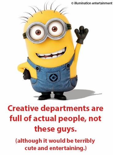
* Some of the artists CRG collaborated with were the most gracious, pleasant creatures on earth. Others were....eh, not so much. It's important to play well with others! You and a client are teammates, trying to bring something to life TOGETHER. This is not the time to be a drama queen and demand a bowl of m&m's with all the green ones picked out. And a creative team is full of designers, not minions.


So what does 2014 have in store for me?

* So happy to say that I will have a booth at Surtex this year! Booth #252. Look out for lots of updates on that subject.

* I am now part of Happy Happy Art Collective, a group of five talented artists I met in Lilla's MATS course.

* It's good to be working with Cricket Magazine again- I'm finishing up an illustration for their May issue.

* Working on illustrating CD packaging for a wonderful client.

* You can find me teaching Illustration at Watkins College of Art and Design CE program.

*Kekacase will be licensing my illustrations on tech cases for smart phones, Kindles, and iPads. The first run will mainly be phone cases, which should debut soon.

* My etsy store will be reopening soon. It will be full of mainly small original paintings.

I'm getting married!!! Nashville, on top of my new found artistic knowledge, also delivered me the great man I'm spending the rest of my life with. So lucky to have him.

Hope 2014 is starting off right for you!


Thursday, January 9, 2014

A Word About Style Part 2: What Is Leading Your Style and How To Use Trends

Part 1 of A Word About Style focused on how to analyze your interests to pin point what your personal style wants to naturally be. In Part 2, I want to focus on some common pitfalls that artists and illustrators face a lot, pitfalls that mislead your personal style and will only serve to trip you up.

Let's jump in. Here are two questions that can seriously complicate your mission to find your personal style.

1) What style is the most popular right now?

2) What style will make me the most money?

Don't get me wrong, these are completely valid questions to be asking yourself, but if they are the only questions or the main questions leading your art-making process, that's a big misstep. Let me elaborate.


Working in a style mainly because it is popular and "out there".

It seems logical, right? if a style seems to be EVERYWHERE right now, than obviously there is a demand for that style and you will have success if you follow suit. 

 First of all, just because numerous people have a certain style in their portfolio, it doesn't guarantee that they are all being hired for that kind of work. They could have had the same thought as you, when really only a fraction of those artists out there working with that style are the only ones getting hired. You may be entering an over-saturated market.

Another issue is that there are numerous trending styles happening at one time, and sometimes they heavily contradict each other. You could drive yourself crazy reinventing yourself constantly trying to "strike gold" when you should be focusing on what you can bring to the table, not trying to chase the Style of The Month.

Don't forget that when everyone is running left, it pays to run right. Being able to do something that not everyone is offering can work to your advantage. 


Picking a style because you think it will get you money.

This overlaps the first point to a certain degree, because if you want to produce work that will make you money, you probably will try to pick a style that is popular. The reason I want to specifically approach this viewpoint about financial success is that letting dollar signs lead your stylistic choices means you will be ignoring more important issues, like do you even enjoy making your artwork?

Let me state that being aware of the marketability of your work is obviously an important factor in your business as an artist. You should be conscious about what markets best suit your portfolio and how you can make the most profit. However, I truly believe that the steps to artistic success should follow in this order:

1) Make art that you enjoy creating (which will always be your BEST work).

2) Figure out what markets your portfolio is best suited for and start marketing yourself to them.

Most of the time, people skip the first step and just try to make work that they think clients want, instead of trying to introduce their own unique product. It's easy to get so focused on just getting hired that a person can find themselves doing work that ultimately they find very unsatisfying (and you've made sacrifices to take on this career path, so why would you settle for doing work you don't even like?).

So, we know that producing work that you enjoy creating is going to make you happier. That' kind of a "duh" point, but there's more to your success as an artist/illustrator if you follow this logic:

1) If you truly enjoy your work, you will invest more time in it and make a superior product every time; thus leading to more clients, more returning clients, and more recommendations.

2) You will be more motivated to get your work out there and seek opportunities, whether it's getting a gallery show or contacting a client you've always wanted to work with.

3) You will be excited to tell people about what you're working on, which will spread the word and improve your networking (My first year in Nashville, I pretty much got all my freelance jobs from simply meeting new people at social events and telling them about my profession).

It's absolutely natural to go through these sort of issues. When I graduated, I started in editorial illustration, mainly magazines. I can't tell you how many promotional images I made that were awkwardly forced into what I thought art directors wanted. Oh! I need a random business guy in a suit. Oh! I need a woman going shopping. I was trying to make things that I thought looked like editorial images because I was a new graduate (excited and anxious in the "real world") and too focused on someone-just-hire-me-already-dammit, when I really should have been concentrating on the fact that my art offered a unique flavor to art directors (and my personal work always turned out much better than these awkward watered-down promotional pieces I was forcing). I started to focus more on my art rather than a paycheck, and eventually my more personal work took off in both galleries and with clients, which made me realize that people were responding positively to the work I loved making naturally.  I just had to find the "home" for my art and not try to force it anywhere. Easier said than done! The point is it can be done.


BONUS TOPIC: HOW TO REALLY WORK WITH TRENDS.

I feel like now is a good time to talk about trends and how one should work with them. Earlier I was just talking about being mislead by popular styles, and naturally trends can be seen as a distraction or pitfall, too.  There are many opinions out there, many that revolve around the thought that trends could be viewed as an invitation to copy other artists or "selling out". Although many artists and illustrators choose to ignore trends, there are some markets (especially surface design and illustration for products), where it's beneficial to be aware of trends and use them to your advantage.

Using a trend in your art is like an Iron Chef using a Secret Ingredient.

I like comparing art-making to cooking (you probably noticed this in Part 1 when I talked about "Style Soup"). If you've ever seen or even heard about the cooking show Iron Chef, it involves two professional chefs that are battling it out and making several dishes to be judged. But wait! There is always the twist of the secret ingredient that both chefs must use. Now, the chefs are already established professionals and have their identifies. Maybe one is known for Asian Fusion food and the other chef has mastered seafood. Well, when they reveal the secret ingredient (Watermelon! Squid!), it's not like the two chefs just throw away all their strengths and completely change their views as chefs- they still cook the same way they do, but now they just incorporate the secret ingredient. Seafood guy makes a watermelon and salmon salad, and Asian Fusion guy creates a watermelon-based ponzu sauce.  In the end they just adapt the ingredient into what they already do well.

That's how you should use trends- as a secret ingredient. So whether it's Pantone's Color of The Year or woodland animals, this isn't about you copying someone else's version of a trend or letting that trend take over your art. It's about your unique vision and take on it. Moustaches are still popular, but don't think you have to regurgitate what you've seen out there. Do it in a way no one has seen before. If you like illustrating animals and that's your thing, maybe you do a series of animals in vintage suits with moustaches and monocles (note: I would pick an alligator or a walrus, I think. Those have a lot of class, right?) 

And it's ok not to use every trend. There are so many trends out there that you will only want to pick the few that interest you.

So there you have it. Thanks for reading! My blog is about to BLOW UP with activity soon. I'll explain in the next post...


Wednesday, January 1, 2014

A Word About Style: Making Your "Style Soup"

Many students and colleagues that I know mention the struggle of finding their "style" and the uncomfortable growing pains that come with it: fear, doubt, and confusion. They are worried about venturing too far from their comfort zone or "being all over the place" when they experiment with new artistic influences and interests.

One of the best ways I like to explain how visual styles come together is by using the metaphor of "Style Soup". When making soup, you take several ingredients and throw them together in a pot. The important thing is to give it a lot of time to cook. If you let it sit there for 5 minutes and then taste your soup, it probably won't taste very good, right? Let it cook all day and you'll have something delicious! Same thing with your own style- it takes a while for different interests and influences to meld together in your own way. This is how you can be interested in seemingly very different things (say, Renaissance painting and contemporary animation) and have it work for you. The challenge is to be patient.

I'll take this moment to point out that this "style soup" will give you a much richer point of view. Too many times people see something they like and say "I like that. I want to make art like that", and stop there. Instead, you should really be thinking "I like that. What in particular do I like about it? Compared to other things I like, are there similarities that point to my personal visual aesthetic?"

Let's take an example and see how different artistic fields and eras have influenced my work. I'll start by introducing some artists to you. You've probably heard of some while one or two might be new to you.

Yoshitaka Amano

I was introduced to Yoshitaka Amano at a very early age when I obsessively watched my brother play the Final Fantasy video games. Amano has done concept design for all of them as well as worked on several other Japanese titles, such as Speed Racer and Vampire Hunter D. In the meantime, he shows his paintings in galleries across the world. His work highlights qualities of Japanese woodblock prints and art nouveau, both sharing visual elements such as an abstracted sense of space and graphic, bold use of shapes and pattern.

Alberto Giacometti

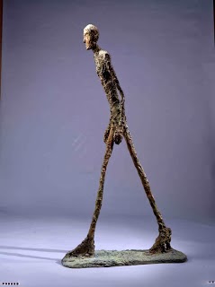
Swiss artist Giacometti is best known for his elongated sculptures of the human figure, but his paintings are equally as explorative and full of texture. By the time he passed away in 1966, he had reached international fame. He preferred to use family members as his models, and I've always loved how direct yet intimate his portraits appear.


Mary Blair

With mid 20th century art and culture blowing up recently, Mary Blair has become even more popular. As a crucial concept artist for Disney on classic movies like Alice in Wonderland and Peter Pan, she also has gained recognition for her role during a time when women were not seen in such crucial positions. Like many artists of the period, Blair pulled from influences such as folk art, which influenced her use of bright (sometimes unorthodox) color choices, use of iconography, and graphic compositions. In addition to working for the Big D, Mary Blair led a successful life as an illustrator producing children's books and numerous advertisements featuring her whimsical style. 


Egon Schiele

It's amazing to see how trendy and fashionable Schiele's paintings of women seem today, even though they are about a hundred years old. An Austrian painter and student of Gustav Klimt, his more provocative work actually landed him a brief stint in jail after being deemed pornographic by local officials. His work finally gained popularity before his untimely death at the age of 28. Focused on the human figure, his paintings are full of energetic linework and paint strokes.


Yoshitomo Nara

Chances are you have come across Nara's delicate and somewhat mysterious paintings of feisty girls and animals in the forms of books or postcard sets somewhere. Born in Japan, Nara sites pop culture as a heavy influence in his large paintings and sculptures. Currently his work is shown in galleries around the world and is also licensed on everyday products you can find in specialty stores.


Whereas some of these you can probably see connections right off the bat, other images probably seem very different at first glance. But, are they??? When you really break down the elements of each artists, many of them overlap in their stylistic choices.


Abstracted interpretation of space


All of these artists design their compositions by activating the space more with color, negative space, and pattern rather than realistic or naturalistic environments. Hand-lettering pops up as a design element, and things are heavily stylized or become icons rather than needing to be realistic interpretations, like Blair's flowers or Nara's girls.


Characters as focal points


Probably one of the more obvious connections between these artists is there focus on unique characters and the impact they have on the viewer.


Unique color story


Since space and figures are being abstracted by these artists, naturally color is also being abstracted, too. It's in these visual worlds that colors are chosen more for their design sense rather than what's actually there in reality (resulting in blue skin or a pink sky, for instance). Whether it's bold and high-constrast...or delicate and very limited, color is used in unexpected ways.

Texture and Pattern


Finally, we see how these artists create interest through texture and pattern. Blair and Amano's pieces are full of pattern, which in itself creates texture depending on the size and nature of the pattern(s) used. Schiele, Nara, and Giacometti's work all feature wonderfully raw texture created by brushes and various mediums. Many times these two elements can be one in the same, with Schiele highlighting the bold print of a woman's dress or Giacometti's strokes turning into a pattern of vertical and horizontal lines as he sketches out the details of a room that his model is sitting in.

In conclusion, when you are able to dissect the pieces you are attracted to, you start to see little connections that reveal more about your personal style. From these artists that I have grown up with, I know that I like character-based images with stylized environments directed more by color and pattern rather than a literal/realistic environments. 

You can start to see how these things influence my work when you take a second look.


Let me point out that it took me a while to see these connections. However, over time I eventually got there (remember earlier when I said time was an important factor in this process?) With each piece of art completed, you get one step closer.  

Let's see some old stuff from my college days and what I was playing around with.


A little different, huh? You can see I love characters and am playing around with how to handle the rest of the composition. There are also different takes on stylizing my characters- some more simple and cartoony, others more rendered.

I will end this post by saying that I believe your style is like your sense of taste: it matures, grows, and is constantly evolving. Remember that this process is about discovery. It's an adventure. Try new things, take a class once in a while, or just play around in your sketchbook. 

And have fun! Thanks for reading. I will be following up this post with another entry about style. More importantly, about what I feel like should not be leading your personal style.


Thursday, December 26, 2013

Porter Flea Paintings!

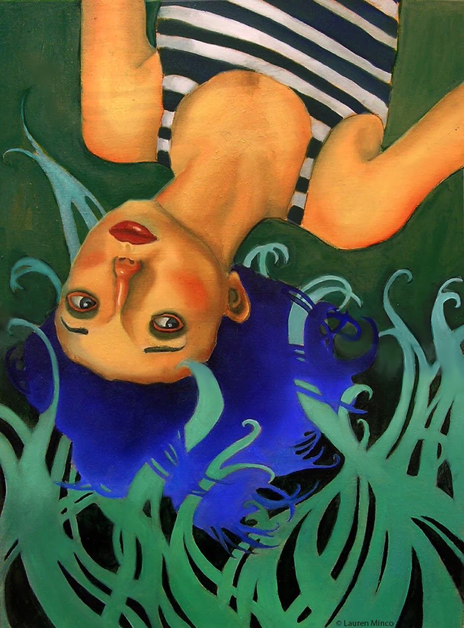
I had a great time as a vendor at Nashville's Porter Flea Holiday Market.  Here are some of the paintings from the sale!


Monday, December 2, 2013

Porter Flea Holiday Market 2013


Oh, snap! If you live in Nashville, the place to be this Saturday is Porter Flea's Holiday Market. I will be sharing a booth with the amazing Tracy Mattocks where we will both be selling cute art and products. Come say hi!

Wednesday, November 20, 2013

4 Online Art Communities To Get Your Creative Juices Flowing

Every artist knows what it's like to sit down at their sketchbook and suddenly realize-uh oh- I have no idea what to do! Luckily, the internet is full of creative websites that have plenty of fun contests, assignments, and prompts that will get you back to art-making in no time. Whether you're making new portfolio pieces or just wanting to have fun with other creative people, here are four artist communities to check out now.


1) Project : Rooftop

Perfect for: Artists focused on character design and/or comics.

Started in 2006, comic creator Dean Trippe and comic journalist Chris Arrant started Project : Rooftop as a way to invite artists to reinvent the costumes of classic and popular comic book characters, from Batman to The Fantastic Four. What has emerged is a wildly entertaining and inspiring collection of concepts from both established and emerging illustrators and cartoonists. Even if you don't participate in the redesign contests, it's addictive to flip through the archive and see all the amazing (and sometimes plain old wacky) redesigns of comic favorites like Superman, Spiderman, and Wolverine. Below are three great and different takes on Wonder Woman.

left to right: Joe Quinones, James Stowe, and Maris Wicks


2) They Draw & Cook

Perfect for: Artists looking to experiment with hand-lettering, graphic designers, and foodies.

Brother and sister team Nate Padavick and Salli Swindell started this website simply as a pet project, but it's grown into a respected and much loved community where artists submit their illustrated recipes. Several published books later (!), you can also visit their equally popular sister site They Draw & Travel, which features an extensive library of illustrated maps. Both websites have developed a cult following and have even become a hub for art directors to find new talent. Artists can start an account and submit recipes/maps at any time, and Nate and Salli will post the cream of the crop on the homepage regularly to keep things fresh (hint: make sure you follow submission directions carefully, as your submitted piece could be picked for the next book!).


The talented Tracy Mattocks

They Draw & Cook co-creator Nate Padavick


Perfect for: Surface designers, artists focused on color and pattern.

Spoonflower is a site that prints custom fabric, wall decals, wall paper and giftwrap from your own uploaded designs. Basically, anything that could have a pattern on it! In the mix is a weekly contest where artists get a theme and make a pattern to go along with it. The winner gets their design sold for a week on the site (and earns 10% of all sales), PLUS a nifty Spoonflower gift card (perfect for buying a few yards of your winning fabric design, right?). Want to learn more about making patterns and repeats? There are many online web tutorials and e-courses available at sites like Make It In Design.


 Contest-winning patterns by the lovely Miriam Bos


Perfect for:  Artists wanting a wide range of creative freedom; recent graduates or newcomers to illustration.

Probably the most well-known site from this list, Illustration Friday was created by illustrator and former art-director Penelope Dullaghan as a way to force herself to regularly make new portfolio pieces early on in her freelance career. The name says it all: A topic is decided upon by the community, and artists have until Friday to post their visual interpretation of it. Past topics have included such themes as "Secret", "Creature", and "Explore". I particularly like this site because it allows people of all backgrounds to participate no matter what medium or style you work in. So whether you are into ethereal, somewhat surreal paintings or cute children's book illustrations, 99% of artists will find they can jump right in and adapt the topic of the week to their way of working. 

 Illustrator Kelly Murphy's submission for the topic "Midsummer Night" 

So what are you waiting for? Dig in!


Friday, November 8, 2013

Lilla Rogers' MATS Class Part B: WEEK 4

Week 4 in Make Art That Sells covered Editorial Illustration. This is definitely the area of illustration that I live in right now- books, magazine articles, advertisements. In fact, the first college class I taught ever centered around Editorial Illustration!


Lilla asked each artist to do a map of the city or town that they currently live in. For me, this meant Nashville. The funny thing is, I already did a map of Nashville last Spring for Nfocus Magazine! Of course, there were going to naturally be differences (Nfocus asked me to illustrate the best picnic spots around town). Still, I was a little nervous because I wasn't 100% happy with the map I did for them. So this time around there was a little added pressure to redeem myself! And you know what? I think I managed that. This is a large gouache painting, and I'm really happy how I was able to make it so much more "me" with the characters and all the little icons that are snuck in there (like the bike and picnic basket. Also love the "This Way" speech bubble/arrow idea. I want to use that more!).

Working on the LAST WEEK of Lilla's class! I wish she offered a Part C!

Wednesday, November 6, 2013

Lilla Rogers' MATS Class Part B: WEEK 3

Week 3 in Make Art That Sells was a market I know a little about: scrapbooking! Why do I know about it? Well, I've never done art for one, but one creative team at C.R. Gibson does A LOT of them, so I'm constantly seeing them around the office (I wandered into our product room and saw bookcases of them- birthday scrapbooks, first-day-of-school scrapbooks, vacation scrapbooks... needless to say there are many, MANY scrapbooks out there that need art.)


Our inspiration was to draw vintage cameras and typewriters, which instantly made me think of how very hipster the idea was once I started sketching.

BOOM. My concept was born, and I simply ran with it.

In the end, it's been...a little awkward in MATS. I feel like I am more comfortable with exploring my own unique solutions to the assignments this semester...but I feel very isolated at the same time. I am one of the more "misfit" artists of the group, and as a teacher myself, I can understand why Lilla can't really pick art like the above example- it doesn't go far in illustrating a point to 300+ individuals because it's SO specific. In the end, I'm proud of myself, but I'm also reminded of how different my art is every week...and sometimes "different" is good. Unique! But sometimes "different" also can mean "unmarketable" in the worst case scenario. My style has been great for editorial and galleries, but this is a fine line I walk in licensing. As I work towards Surtex, it will be interesting to see what I develop- my style could lead to wild success, or a complete belly flop...(bum bum BUUUUUUUM). Stay tuned...

Monday, October 28, 2013

Lilla Rogers' MATS Class Part B: WEEK 2

Woo! A little behind on the posting! Truly, last semester during the MATS class I had NO TIME to breathe, let along blog, but this time I am trying to talk about the class as it happens, rather than just making one post afterwards where I desperately try to remember everything.


So yes! Here was my piece for Week 2: Baby Apparel. I think everyone in this class has one week in the schedule where they kinda feel like it may be an assignment that throws them through a loop- maybe they are even a little concerned about bombing it. I wouldn't say I was worried about utterly failing at Baby Apparel, but I was curious to see how I would do. Even though my work seems to be very child-friendly, the market can have a very fine line when it comes to determining what's "cute" versus "cute but a little weird". Or "edgy". People love to use that word , so let's throw that one in. With kids' stuff, it's ok to be "edgy". "Edgy" can be fun and age appropriate. But babies...usually you don't push it for that group. My challenge was to have my homework look like "mine" without going too far in that "edgy" world (ok, we're shelving that word now. It's had plenty of stage time during this post).

In Part A, I was not able to make the optional coordinating patterns for my bolt fabric piece, but this time I wanted to make sure I had everything: the main art, the extra patterns, the placement graphic... After I was done uploading it to the class Flickr page, I just kinda sat in my chair and looked at it. I mean, I REALLY looked at it. For like a good 20 minutes. Part of this was because I was letting the adrenaline leave my body after coming waaaaay too close to the submission deadline. However, another part of it was, well...I had pleasantly surprised myself. I liked it. It was strange looking at it, because in a way I was meeting another artist for the first time, and that artist was just a different facet of myself. It was very rewarding to see it all come together and realize that I could do this age group without loosing the essence of my characters or artistic "flavor" as I like to say. Furthermore, I was proud that I accomplished making the animals the stars of the show.

I actually need to post about the most recent assignment: scrapbooking! We just turned that assignment in this past weekend- I'll get it up here later this week. :)

Monday, October 14, 2013

Lilla Rogers' MATS Class Part B: WEEK 1


A week ago, the second semester of Lilla Rogers's Make Art That Sells Class started, and boy it's been hectic ever since! Our assignment was to make a Christmas card inspired by vintage holiday items (ok, technically we were suppose to make 2, but I was lucky to get one done considering I had about 2 1/2 days to pump this out).

In the end, this is how I feel about it.

PROS:

I like the color. I had a collection of pantone chips from work taped down to one page in my sketchbook, and I realized it was perfect for this assignment. During my research, I noticed there was a lot of black used in old holiday tablecloths and such. It seemed so dramatic, and I loved pairing that with more delicate shades of green and pink.

I like my icons. The first week of Part A, I was missing something very vital from my piece: my characters. There was nothing that seemed to nod back to that strength. This time I managed to be inspired by all the vintage bird ornaments as well as the partridge from The Twelve Days of Christmas and came up with this guy. In spats! He adds a much needed warmth to the whole imagine. Other things, like the addition of geometric pattern and the candy jars, were favorite details.

I like my hand-lettering. In a perfect world it would be bigger, but in the end I'm quite pleased with it.

CONS:

I'm not crazy about the composition. The truth is, depending on what I'm doing, sometimes it's better for me to make art and then assemble it digitally, and other times I do just fine getting it right paint to paper. THIS image, however, was caught between multiple ideas and just never got solved. It's not an organic mosaic, but it's not a grid-like illustration either (places like the small candy under the partridge or the holly seem to awkwardly fill in space and break up straight lines). Although the icons are all fun, it's crowded. This either needed to be busting full of small cute icons, or one icon should have clearly dominated the composition with others removed. The partridge is bigger...buuuuut not quite as big as it should be to really be the focus. It's just a little awkward.


CONCLUSION:

Although I'm not 100% satisfied with my illustration, I figure if I can walk away saying I like three things about it (and only have one major complaint), that's not too shabby. The first week is always a little wobbly, AND did I mention I only had 2 1/2 days??? Phew!

Friday, September 20, 2013

When Your Neighbor / Aunt / Dentist’s Sister-In-Law Wants You To Illustrate Their Children’s Book


Today’s post is inspired by a question I get pretty regularly, so I thought it would be good to cover it on the blog. Many illustrators have aspiring writers in their community, whether it’s a family member or someone in your town that hears about your talent through the grapevine.  

There are 2 scenarios to consider.


Scenario 1: “I’m writing a children’s book to send around to publishers. Can you illustrate it?”

First of all, if someone says this exact sentence to you, what they have really just said in 10 seconds is I have no idea how this children’s book thing works.  Why? Because publishers buy text for children’s books without the art.   It is the Art Director of a company that researches and reviews all the art submissions they get, and they will want control over which illustrator is paired up with a purchased text.  It’s like when a screenwriter goes to Hollywood to sell their script- they just have to sell the script, not make the film because the studio handles casting, finding a director, financing, marketing, etc. Therefore, authors don’t need to stress over the whole art issue- let them know they can submit their text/story without illustrations to publishers (Most publishers have submission policies on their website. You can also reference the book Children's Writer's & Illustrator's Market. There is one printed every year with up-to-date info on each publisher's contact information and what they are looking for).

Now, Obviously I’m sure there are examples of an author/illustrator team who have submitted their work together and it was bought- it’s just rare, or usually there is someone of importance or notoriety involved (For instance, I know an artist who is illustrating a children’s book for someone else and they are pitching it with success, but that “someone else” is a pretty well-know TV actor). 

Also, illustrators who also write are welcome to submit text with art. Usually this is done with a rough B+W example of a book called a dummy, which shows the layout and sketches of the pages and a copy of one or two examples of completed illustrations to show what it looks like 100% done. Anyway, this post is more about authors coming to you as an illustrator. so let’s get back to that.

Scenario 2: “I’m self-publishing a children’s book. Can you illustrate it?”

Most of the time this author is doing a small-run for family or they plan to sell it themselves. They may try to convince you with lines like “it’ll be good exposure” or  “ You’ll get some portfolio pieces out of it”.  If they can pay you, it’s usually not very much, or at least not a lot considering the amount of work you are about to commit to such a project. Sadly, it’s not uncommon for these projects to fizzle out because of “life issues”, a lack of commitment from the author after they realize how much work it is, or other assorted problems down the road (you get fed up with the 835th revision or  maybe the author has changed the story 20 times while you’ve been working on illustrations).

Now, I have to admit that I approached some friends recently to do an album cover for free, but there were definitely benefits to this decision beyond “I got a portfolio piece out of it”. Plus I had complete control and it took a lot less time than a whole children’s book. But in the end I understand that you may still be interested in such a task because of the other person involved, or maybe you really just need a personal project, too. So let’s get into some points you should remember if you decide to do this.

Remember that many people who request this are doing a book as a side project.
They have jobs and other responsibilities that can transform a collaboration like this into a very lengthy project. Children’s books take roughly 8-12 months, and that’s with a publisher and art director who are both in it 24/7, full speed, so you can imagine how long something like this may take when it’s not someone’s main focus or job in life.

Make sure you have answers to basic questions before you begin.
I knew someone once who was working on a children’s book for a man’s grandchildren. By the time I was introduced to this artist, it had been almost two years since the project started. She wanted my advice, and to familiarize myself with where she was I asked for some information:  How many pages/illustrations will be in the book? What are the page dimensions? How much are you going to get paid? Do you have a rough due date in place? Her face went blank as I realized she could not answer these questions after almost two years. It’s no surprise that within a couple of months the man and artist decided to go their separate ways.

Also, It’s important to realize that if someone is self-publishing, different routes of manufacturing have different options. A place that can make your book from scratch may be able to do any amount of pages you want, although some page runs may be cheaper. Page sizes can be custom made at a printer, but once again standard pages sizes will be cheaper than some random funky page size that is selected. If the author is making books through a website like lulu.com or blurb.com, there are set page dimensions and page amounts you must pick from, so that decision should come early in the process.

Really consider a fair price for your time and effort.
Obviously most self-publishing authors can’t afford to pay what publishers do (anywhere from $7,000- $14,000 depending on the project, sometimes even more if you are a hot shot). Usually when people come to me with this question, someone has offered them $300-$500. This is INSANELY low when you consider how many illustrations are being made, any layout work, and revisions. For example, if there are 30 illustrations to make, you would be getting paid roughly $10-$16 PER IMAGE. Consider what you want to get per illustration, than multiply by how many images you need to get a ballpark amount (don’t forget the cover!). Most artists would give a discount to friends and family, sure, but just make sure you are taking care of yourself. Don’t get underpaid because you want to “be nice”.

Most importantly… do not “depend” on the situation in any way.
 If you’ll humor me with a tangent, my mother and I were once watching day time court TV (because we’re classy like that), and a person was going after another family member for a loan (of course). My mom turned to me and said “if you ever loan money to family, make sure you’re OK with never getting it back. Just think of it as a gift”. Now, she didn’t say this because my family is compiled of jerks and cheapskates. She was telling me if I ever made that decision, my emotional sanity would be healthier if I was at peace with whatever outcome may happen (and probably the relationship with said family member). Naturally, another point is don’t give away anything you absolutely need later, because you may not get it back and things will get ugly.

I feel like deciding to illustrate someone’s children’s book needs the same outlook, because you ARE giving your time, energy, and probably some money when it comes to supplies or resources (or forfeiting paid jobs to take on the project). Do not depend on the book being seen by the right person and being your “big break”. Do not depend on the book when it comes to paying your rent or bills. If you can honestly say that this is a fun labor of love and you’ll be ok if it fizzles out and you’re left with just a handful of illustrations, then you have the right mentality. Like I mentioned before, some benefits are beyond just dollar signs, and its up to you to decide if the risk or adventure of such a project is worth it.


When I decided to do my friends’ album art, this was the decision-making process behind it:

1)   I have a full-time design job and did not depend on any financial outcome from the project, nor did I   expect one.

 2)  I was looking for a pet project to try some new techniques, but I wanted it to be “real” so I would commit myself 100%.

      3)  Although these friends were given the invitation to provide input from the beginning, I had complete control over the final art and what I wanted to illustrate. They did not art direct me.

4) The collaboration with these friends has resulted in specific opportunities coming my way which would not be possible through other avenues of marketing- it was a highly specialized type of networking I was doing within the music community.

 5)   I did not have a strict deadline. Therefore, I could stop any time to work on paying jobs that popped up from clients.


Make a contract, OR at the very least “write up a summary”.
If you are working with someone who you know on a very personal level, I understand how the word “contract” might hurt your ears. Obviously, you do not want to offend family or friends with such a professional word that makes it sound like the two of you can’t trust each other. That’s why I say you should at least “write up a summary”, just to make sure everyone’s on the same page. With everything. Time. How many illustrations you’re doing. Important dates. Any money and how it will be paid. You and the author should sign it. If it’s a close family member, give a copy to another trusted person in your circle so that they can be a mediator in case any problems come up.  I can’t guarantee it will fix all problems, but it should help prevent and sort out any confusion that comes along during your journey.

Whatever you decide to do in such a scenario, I hope some of these points listed above help you navigate the process. Cheers!

Friday, September 13, 2013

Out right now is the 2013 Tennessee State Fair poster I did back in May. So much fun! Scroll down to see the two sketches. I pretty much knew I wanted to do the version with allllll the characters, but I tried one that was less complicated with just the one girl. I might have to do her another time just for fun (I'm kinda fond of those very content racing pigs).